#HTML CSS Nav bar
Explore tagged Tumblr posts
Visit Tumblr Blog
Explore Tumblr blogs with no restrictions, modern design and the best experience.
Last Seen Tumblr Blogs


Fun Fact
Tumblr was attacked by a cross-site scripting worm deployed by the Internet troll group GNAA on Dec 3, 2012.
Text
1 note
·
View note
Text
[life update: I entered a hackathon]
I entered a hackathon and one of the task is to build a site with only use HTML, CSS & JavaScript and also make the features and design pixel perfect lol. That’s the life update. I know I’m going to win but damn I’m stressed and I’ve barely completed the nav bar but I know I’ll win it.
21 notes
·
View notes
Text
macOS Dock Inspired Navigation Bar in Pure CSS
This is a pure CSS approach to creating a responsive, animated, interactive navigation bar inspired by macOS dock interfaces. It can be used to generate creative and user-friendly bottom navigation on your web app, where nav items (typically application icons) dynamically resize and reveal tooltips upon mouse interaction. How to use it: 1. structure your HTML to include the dock and your app…
4 notes
·
View notes
Text
8 CSS & JavaScript Snippets for Creating Sticky Elements — Speckyboy
New Post has been published on https://thedigitalinsider.com/8-css-javascript-snippets-for-creating-sticky-elements-speckyboy/
8 CSS & JavaScript Snippets for Creating Sticky Elements — Speckyboy
Modern websites often feature extensive scrolling. Long pages are common on desktop devices, but are even more frequent on mobile screens. The practice creates usability challenges for tasks like navigation and referencing important information.
That’s where “sticky” design elements come in handy. They allow users to scroll without losing access to your site’s menu. You can also use them to keep ads in view, attach social media sharing buttons to the viewport, or create fun special effects.
Implementing a sticky element can be simple, as CSS has a dedicated position property for this function. JavaScript can be used for building more robust features. As usual, there are several methods to achieve your goals.
We searched the CodePen archives to find interesting examples of sticky elements in use. Below, you’ll find various options that enhance the user experience. So, get stuck in your easy chair and be inspired by these code snippets!
Pure CSS Header Animation to Sticky Navigation
Created by Amit
Sticky headers are among the most popular use cases. On Chromium browsers, this snippet uses CSS to transform a tall and narrow header into a full-screen bar upon scrolling. Unsupported browsers receive a narrower, taller, sticky header. Keyframe animation is used to create smooth transitions. The feature is useful, lightweight, and attractive.
See the Pen Pure CSS header animation to sticky nav by Amit
Sticky Responsive Sidebar Navigation
Created by Areal Alien
Sidebar navigation can also take advantage of staying put during scrolling. Hovering over the sidebar expands the navigation to include text labels – it works on mobile too. However, you might also reserve this concept for large screens and use the traditional “hamburger” menu for mobile.
See the Pen Sticky responsive sidenav by Areal Alien
CSS Sticky Table Header & Column
Created by Mike Golus
Long HTML tables can be a pain to read. You have to memorize the column headers to understand the context. Sticky headers make even the busiest tables easier to read. Using position:sticky (and a few other tricks) on the first row and column enables scrolling without losing sight of key information. The examples in this Pen demonstrate how it’s done.
See the Pen CSS Sticky Table Header and Column by Mike Golus
Long Scroll Sticky Sections
Created by Burmese Potato
Here’s a unique way to denote the various sections of a long page. Scroll down the page, and the episode number (displayed in the left column) sticks until you reach the end of the section. The snippet combines sticky positioning with the calc() property on the container’s height to keep the number in view. This little bit of CSS adds a nice touch to the user experience.
See the Pen Pretty Sticky by Burmese Potato
Just Another Sticky Section Layout
Created by Misala
Sticky design elements can also be used to show off product features. Scroll down this page and watch as featured text and videos change. The layout occupies the entire screen viewport and is responsive for mobile devices. It’s a high-end feature sure to capture a user’s attention.
See the Pen just another sticky section layout by misala
Multi-Navigation Sticky Bars & Layout
Created by Den
This snippet asks the question: What if you have more than one navigation bar? The first bar is sticky by default. Scroll past a few sections, and a second sub-navigation bar lines up underneath. That second bar also features a neat frosted glass look as content scrolls underneath.
See the Pen Sticky layout + filters #2024 by Den
Sticky Video with CSS @container scroll-state()
Created by Jhey
We’re seeing more websites implement sticky videos, where the presentation sticks to the bottom corner upon scrolling. It allows users to view the rest of your content without losing sight of the video. Here, CSS container queries are used to reposition the video player. Use the included config panel to see how different settings impact the animation effects.
See the Pen CSS @container scroll-state() faux PiP video by Jhey
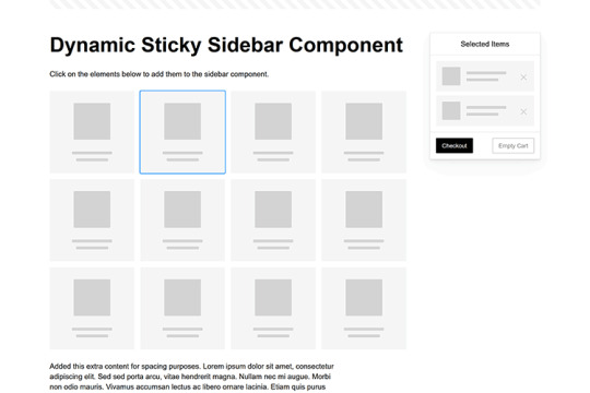
Dynamic Sticky Sidebar Component
Created by Ryan Mulligan
Features like shopping carts are a perfect fit for sticky sidebars. The UI makes it easier for shoppers to keep track of their cart and, most importantly, finish their purchase. This sidebar widget keeps track of cart contents and sticks to the screen while you scroll in the page content area.
See the Pen Dynamic Sticky Sidebar Component by Ryan Mulligan
Stick With What Works in Your Designs
We may think of sticky elements as being used for site headers and navigation. However, the examples above show that they can do much more. There are so many creative possibilities for informing and entertaining users.
What’s more, CSS can do a lot of the heavy lifting for you. Several snippets in this collection don’t require a single line of JavaScript. Still, it’s nice to know you can add some DOM manipulation when needed.
We hope this collection sparked your imagination! Check out our CodePen collection for even more sticky snippets.
Related Topics
Written by Eric Karkovack
Eric Karkovack is a web designer and WordPress expert with over two decades of experience. You can visit his business site here. He recently started a writing service for WordPress products: WP Product Writeup. He also has an opinion on just about every subject. You can follow his rants on Bluesky @karks.com.
Read more articles by Eric Karkovack
#2024#ADD#alien#amp#animation#Articles#attention#Building#Business#buttons#Capture#change#chromium#code#container#content#CSS#CSS Layout Snippets#CSS Snippets#Design#desktop#devices#easy#effects#Featured#Features#Filters#Full#glass#hamburger
0 notes
Text
Adding a Search Bar to Amethyst
I've been asked how to add a search bar to Amethyst, and since I thought this tutorial would be useful, I decided to post it. Please read under the cut.
First, you'll need to add some CSS. You can place this CSS right under the <style> tag. If you prefer to be precise, paste it right before #posts.
input { width: 100%; background-color: var(--background); padding: calc(var(--spacing) / 2); font-family: var(--accent-font); font-size: 0.85em; text-transform: uppercase; letter-spacing: inherit; color: inherit; border: 1px solid var(--borders); border-radius: var(--radius-amount); } input:focus { outline: 0; } input::placeholder { color: rgba(var(--text), 0.8); transition: color 0.3s; } input:focus::placeholder { color: rgba(var(--text), 0.4); }
This is the styling of the search bar, and it matches the ones I've already added in my other themes.
Then, add this line of HTML right after </nav>: <form action="/search" method="get"><input type="text" name="q" autocomplete="off" value="" placeholder="{lang:Search}..." /></form>
And you're done! Feel free to reach out if you have any issues.
1 note
·
View note
Text
Mastering Logo Visibility in Scrollable Hero Sections: A Comprehensive Guide

Introduction
Navigating the intricacies of web design often leads to unique challenges, and one such puzzle involves strategically hiding the logo in the menu until users scroll down to the hero section. This nuanced requirement adds a layer of sophistication to the user experience, aiming for a seamless transition as visitors explore the webpage. In this guide, we'll delve into the specifics of this challenge, addressing the need to keep the logo concealed in the initial scroll while ensuring it elegantly surfaces once users venture into the hero section. Let's unravel the solutions and techniques that transform this design goal into a reality, enhancing the visual appeal and functionality of your website.
Desired Scrolling Animation
As we embark on the journey of refining our website's design, one key aspiration is to implement a smooth scrolling animation from the captivating hero section to the menu. This animation serves as a visual bridge, offering users a seamless transition as they navigate through different sections of the webpage. The significance of a fluid scrolling animation cannot be overstated. It not only adds a touch of elegance to the user experience but also creates a sense of cohesion, making the navigation feel intuitive and engaging. In this section, we'll explore techniques to achieve this desired scrolling animation, ensuring that every scroll becomes a delightful journey for the user.
Challenges in Logo Visibility
Our quest for an aesthetically pleasing web design encountered a hurdle when attempting to hide the logo in the nav bar until users scroll down. Despite initial efforts, a challenge emerged – the premature visibility of the logo even with minimal scrolling. This deviation from the intended behavior necessitates a deeper exploration for a more refined solution. Drawing inspiration from the seamless design of (https://www.ribalta.pt/), where logo visibility unfolds precisely at the right moment, we recognize the need for a tailored approach. In this section, we'll dissect the challenges faced in concealing the logo and set the stage for implementing a solution that aligns with our design goals.
JavaScript Solution
To address the challenge of controlling logo visibility with precision, we turn to the dynamic capabilities of JavaScript. Our solution involves intelligently managing the logo's display based on the user's scroll position. This not only ensures a seamless transition but also allows for a tailored and responsive user experience. Let's dive into the implementation with the following JavaScript code snippet, which can be customized to suit your specific design requirements: JavaScript// Add an event listener to detect scroll events window.addEventListener('scroll', function() { // Define the scroll position where the logo should become visible const scrollThreshold = 200; // Get the current scroll position const scrollPosition = window.scrollY; // Select the logo element const logo = document.getElementById('your-logo-id'); // Toggle the logo's visibility based on the scroll position if (scrollPosition > scrollThreshold) { logo.style.display = 'block'; } else { logo.style.display = 'none'; } }); This JavaScript solution empowers you to dynamically control when the logo becomes visible, ensuring it seamlessly appears as users scroll down. Feel free to adapt the code to match your HTML structure and styling preferences.
CSS Transition Approach
As an alternative to JavaScript-based solutions, a CSS transition approach offers a lightweight and efficient way to control logo visibility during scrolling. By leveraging CSS classes and transitions, we can achieve a seamless fade-in effect as users explore the webpage. Begin by defining a CSS class for the logo, specifying the desired transition properties. Here's an example code snippet: CSS/* CSS */ .logo { opacity: 0; transition: opacity 0.5s ease; } /* Add a class to make the logo visible when scrolled */ .logo.visible { opacity: 1; } Now, enhance your HTML structure by applying this class dynamically using JavaScript: JavaScript// JavaScript window.addEventListener('scroll', function() { const logo = document.getElementById('your-logo-id'); const scrollThreshold = 200; const scrollPosition = window.scrollY; // Toggle the 'visible' class based on the scroll position if (scrollPosition > scrollThreshold) { logo.classList.add('visible'); } else { logo.classList.remove('visible'); } }); This CSS transition approach provides a smooth fade-in effect, enhancing the logo's visibility as users scroll through the hero section.
Intersection Observer Method
The Intersection Observer method introduces a powerful and efficient way to track the visibility of elements as they enter or exit the viewport. Leveraging this method, we can precisely manage the logo's visibility based on its intersection with the hero section, providing a seamless and performance-friendly solution. Let's delve into the implementation using the Intersection Observer. Begin by creating an observer and defining the target element (in this case, the hero section and logo): JavaScript// JavaScript const observer = new IntersectionObserver(entries => { entries.forEach(entry => { const logo = document.getElementById('your-logo-id'); // Toggle logo visibility based on intersection ratio if (entry.isIntersecting) { logo.style.opacity = '1'; } else { logo.style.opacity = '0'; } }); }, { threshold: 0.5 }); // Adjust the threshold as needed // Specify the target element (hero section) const heroSection = document.getElementById('your-hero-section-id'); // Start observing the hero section observer.observe(heroSection); This Intersection Observer method efficiently manages logo visibility changes based on the hero section's intersection with the viewport. Adjust the threshold parameter to control when the logo becomes visible. Enjoy a precise and responsive solution to enhance your website's scrolling experience.
Frequently Asked Questions
Q1: How can I hide the logo in the menu until users scroll to the hero section? A1: Achieving this effect requires a strategic approach. Consider using JavaScript to dynamically control the logo's visibility based on the user's scroll position. Explore our guide for detailed solutions. Q2: Are there alternative methods to control logo visibility during scrolling? A2: Yes, our guide explores multiple approaches. You can leverage CSS transitions for a lightweight solution or utilize the Intersection Observer method for precise visibility control. Choose the method that best suits your project requirements. Q3: Can I customize the logo visibility transition duration? A3: Absolutely. Depending on your design preferences, you can adjust the transition duration in both JavaScript and CSS solutions. Experiment with different durations to find the optimal visual effect. Q4: How can I adapt these solutions to fit my specific HTML structure? A4: The provided code examples are customizable. Feel free to tailor the JavaScript and CSS snippets to match your HTML structure and styling preferences. Experimentation is key to achieving the desired outcome. Q5: Are there performance considerations when using these methods? A5: Our solutions aim for efficiency, but it's essential to consider performance. Intersection Observer, for example, is designed with performance in mind. Monitor your webpage's performance and make adjustments as needed. If you have additional questions or need further assistance, don't hesitate to reach out. We're here to help you navigate the nuances of logo visibility in scrolling animations.
Conclusion
In conclusion, our exploration into concealing and revealing logos during scrolling has unveiled versatile solutions catering to different preferences and project requirements. Whether you choose the dynamic control offered by JavaScript, the elegance of CSS transitions, or the precision of the Intersection Observer method, the goal remains clear: to achieve a seamless and visually pleasing logo visibility transition. As you embark on implementing these solutions, remember that experimentation is your ally. Tailor the provided code snippets to align with your HTML structure, styling preferences, and overall design vision. Each project is unique, and finding the ideal solution involves a bit of creative exploration. The key takeaway is the importance of creating a polished and user-friendly experience for your audience. Whether it's the subtle fade-in of a logo or a precise reveal triggered by scrolling milestones, a well-executed logo visibility transition enhances the overall aesthetics and interactivity of your website. Happy coding, and may your logos seamlessly reveal themselves to the delight of your users! Read the full article
0 notes
Text
How To Use CSS To Create Menus And Navigation Bar
CSS stands for Cascading Style Sheets, and it is a language that can be used to style and customize HTML elements on a web page. CSS can create custom menus and navigation bars by using properties such as display, position, flexbox, grid, hover, etc.
To create a CSS menu, you need to define two things: the menu items and the menu style. The menu items are the links or buttons that you want to display on your menu. The menu style is the way you want to arrange and decorate your menu items.
For example, if you want to create a simple horizontal menu with four items, you can use the following code:<!-- Define the menu items --> <ul class="menu"> <li><a href="#">Home</a></li> <li><a href="#">About</a></li> <li><a href="#">Services</a></li> <li><a href="#">Contact</a></li> </ul> /* Define the menu style */ .menu { list-style: none; /* Remove the bullet points */ display: flex; /* Use flexbox to arrange the items horizontally */ justify-content: space-around; /* Distribute the items evenly */ align-items: center; /* Align the items vertically */ } .menu li { padding: 10px; /* Add some space around the items */ } .menu a { text-decoration: none; /* Remove the underline */ color: black; /* Set the text color */ } .menu a:hover { color: white; /* Change the text color on hover */ background-color: blue; /* Add a background color on hover */ }
This will result in the following output:
![menu]
As you can see, the menu items are displayed horizontally, with some spacing and styling. You can also use different properties or values for different items to create more complex and creative menus.
To create a CSS navigation bar, you need to define two things: the nav element and the nav style. The nav element is a semantic HTML element that represents a section of a page that links to other pages or sections. The nav style is the way you want to position and decorate your nav element.
For example, if you want to create a simple fixed navigation bar with four items, you can use the following code:<!-- Define the nav element --> <nav class="navbar"> <ul class="menu"> <li><a href="#">Home</a></li> <li><a href="#">About</a></li> <li><a href="#">Services</a></li> <li><a href="#">Contact</a></li> </ul> </nav> /* Define the nav style */ .navbar { position: fixed; /* Fix the position of the nav element */ top: 0; /* Set the top position to zero */ left: 0; /* Set the left position to zero */ width: 100%; /* Set the width to 100% of the viewport */ height: 50px; /* Set the height to 50 pixels */ background-color: blue; /* Set the background color */ } .menu { list-style: none; /* Remove the bullet points */ display: flex; /* Use flexbox to arrange the items horizontally */ justify-content: space-around; /* Distribute the items evenly */ align-items: center; /* Align the items vertically */ } .menu li { padding: 10px; /* Add some space around the items */ } .menu a { text-decoration: none; /* Remove the underline */ color: white; /* Set the text color */ } .menu a:hover { color: black; /* Change the text color on hover */ }
This will result in the following output:
![navbar]
As you can see, the nav element is fixed at the top of the page, with a blue background and white text. You can also use different properties or values for different elements to create more complex and creative navigation bars.
CSS menus and navigation bars can make your web pages more user-friendly and attractive. You can use them to create different types of menus and navigation bars, such as vertical, dropdown, responsive, etc. You can also combine them with other CSS properties and selectors to create more unique and customized menus and navigation bars.
If you want to learn CSS from scratch must checkout e-Tuitions to learn CSS online, They can teach you CSS and other coding language also they have some of the best teachers for there students and most important thing you can also Book Free Demo for any class just goo and get your free demo.
0 notes
Note
html shopping website, for an assignment so be quick
hi sorry that this took abt 2 days but it's ready now !!
code demonstrates a basic structure for a shopping website homepage, including a header, navigation bar, product listings, and a footer.
note that this is a basic example, and you can further customize and enhance the HTML code to include more features, such as additional pages, product details, user authentication, and shopping cart functionality. Additionally, you would need to provide actual image URLs or replace the src attributes with the correct paths to your product images.
<!DOCTYPE html>
<html lang="en">
<head>
<meta charset="UTF-8">
<meta name="viewport" content="width=device-width, initial-scale=1.0">
<title>Shopping Website</title>
<style>
/* CSS styles for the website */
/* Header styles */
header {
background-color: #333;
color: #fff;
padding: 20px;
text-align: center;
}
h1 {
margin: 0;
}
/* Navigation bar styles */
nav {
background-color: #555;
color: #fff;
padding: 10px;
}
nav ul {
list-style-type: none;
margin: 0;
padding: 0;
display: flex;
justify-content: center;
}
nav ul li {
margin: 0 10px;
}
/* Product listing styles */
.product-listing {
display: flex;
flex-wrap: wrap;
justify-content: center;
}
.product {
background-color: #f4f4f4;
padding: 20px;
margin: 10px;
width: 300px;
text-align: center;
box-shadow: 0 2px 5px #ccc;
}
.product img {
width: 200px;
height: 200px;
margin-bottom: 10px;
}
/* Footer styles */
footer {
background-color: #333;
color: #fff;
padding: 20px;
text-align: center;
}
</style>
</head>
<body>
<!-- Header -->
<header>
<h1>Shopping Website</h1>
</header>
<!-- Navigation bar -->
<nav>
<ul>
<li><a href="#">Home</a></li>
<li><a href="#">Products</a></li>
<li><a href="#">Cart</a></li>
<li><a href="#">Contact</a></li>
</ul>
</nav>
<!-- Product listings -->
<div class="product-listing">
<div class="product">
<img src="product1.jpg" alt="Product 1">
<h2>Product 1</h2>
<p>$19.99</p>
<button>Add to Cart</button>
</div>
<div class="product">
<img src="product2.jpg" alt="Product 2">
<h2>Product 2</h2>
<p>$24.99</p>
<button>Add to Cart</button>
</div>
<div class="product">
<img src="product3.jpg" alt="Product 3">
<h2>Product 3</h2>
<p>$14.99</p>
<button>Add to Cart</button>
</div>
<!-- Add more product listings here -->
</div>
<!-- Footer -->
<footer>
<p>© 2023 Shopping Website. All rights reserved.</p>
</footer>
</body>
</html>
0 notes
Text
did u know that instead of having the logo, search bar, and nav icons inside the header be 3 separate items they actually for reasons known only to them and god made the logo a child element of the search box
like
header
>search box
>>logo
>navigation
#i can switch the nav and search but the logo is INSIDE THE SEARCH BAR so i can't keep that on the left#i can't edit the html only the css i don't think you can relocate a grandchild to a different child within a parent
80 notes
·
View notes
Text
I feel like it took me too long to realize I'm primarily driven by internal motivations. And I think that's sort of because I did do well in school growing up?
School came easily for the most part, and I thought it was going to get me somewhere, so putting in the effort when I needed to was something I "wanted". And I think that made me believe I was motivated by external factors (grades, parental and teacher expectations, etc...) instead.
But gosh, in my last year of undergrad? When I realized I actually had nothing lined up and wasn't interested in jobs in my field and grades didn't matter anymore? I could not make myself care. At all. Like I almost failed two classes. On the other hand, I've tried multiple times to get into coding in the past, but it never worked out. I enrolled in a program once, but I felt like I was learning all these things I'd never actually use, and once again I couldn't make myself care. Now I'm teaching myself HTML/CSS/JavaScript/etc... (the motivation being that I want a job where I can work from home/have flexible hours) and I'm having so much fun with it? Because I'm choosing how I learn. And I have a tangible (and in my mind achievable) goal, so I'm actually excited about it.
(Also...obligatory something something about how it's never too late to change what you want to do with your life.)
#kayla rambles#i'm currently more excited about coding than writing?#i don't expect THAT to last but the fact i've gotten this far is still promising#and fanfiction is weirdly enough responsible for me wanting to possibly make a career out of this if i can#it made HTML/CSS seem less scary since i learned some for ao3#AND it taught me that i can actually finish projects without external deadlines when i actually want to#anyways i made a nav bar stick to the top of a web page today and got really excited about it#and like that's not HARD but i'm still new at this and it made me very happy and then i wanted to ramble here akjbdfsk
9 notes
·
View notes
Text
I've made my blog's sidebar so much sexier by the way. if you even care
#rambling#spent a few days suffering at the hands of CSS and HTML to add a little tag nav section#with little menus for all my tags#and also made the search bar look nicer and do a little animation when you click on it#the last bit i'm trying to figure out is how to make the sidebar only able to be dragged and moved around by one point#so the text within can be selected and such#right now i've only been able to make it not-draggable around the avatar section but i'll get there when i have the time!!!#another fun thing i wanna add is a little secret section somewhere to play secret fun music from :] but again when i have the time
2 notes
·
View notes
Link
Ribbon Style Navigation Menu
#css nav#css navigation bar#ribbon shape css#css ribbon tutorial#css navbar with ribbon#ribbon style menu#learn to code#css#html
1 note
·
View note
Text
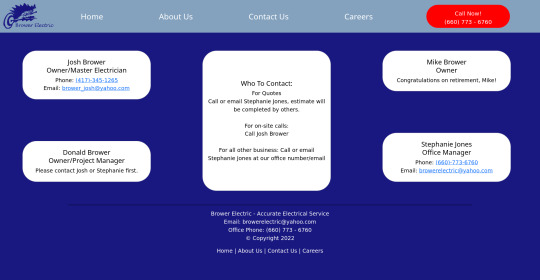
Brower Electric - Commit #6 - Contact Us
This push, I added the Contact Us page.
On Desktop:
On Mobile:

The HTML:
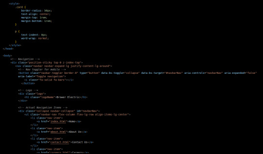
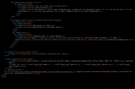
I used some internal CSS in the head tag because I wanted the cards and text on this page to look a little different.
Our nav bar (and this is standard on all pages) is contained in a div that sticks it to the top of the page, even as you scroll. The z-index-top class makes the z index 100 so it overlaps everything.
The rest of the navbar is the same as other pages.
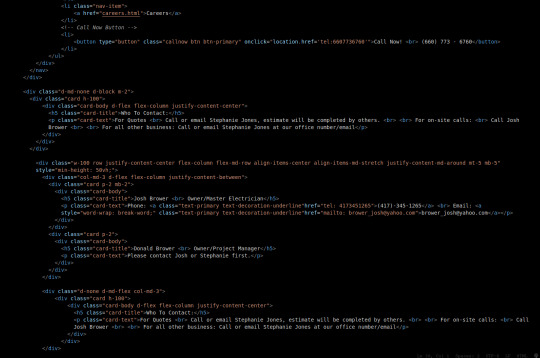
So the first div you see after the nav bar is only visible on medium screens and below. This div contains a card that has been flexed to center it's content. This card is the instruction card for who to contact. On bigger screens, a nearly identical one will appear in the center of the Contact Us grid.
Our Contact Us grid uses Bootstrap rows and cols. The row has a 100% width and a minimum height of 50% of the viewport. It justifies it content to the center of the column on mobile but otherwise it justifies content by the space around in a row. It aligns items center on mobile and stretches them out on other devices. It also has a margin on the top and bottom.
The cols are flex columns that justify their content based on the space between. That's how we get the vertical spacing on desktop.
The cards have some padding and a bottom margin, and the contact links are formatted.
The middle col only contains the who to contact div that reveals on medium devices and up.
The footer is the same as the other pages.
The CSS:
I did not add any external CSS for this page besides the z-index-top class I mentioned earlier. I'm pretty proud of this because it means that I am getting better at utilizing Bootstrap 5 classes.
Conclusion:
I should learn more about Grids. Their responsiveness is powerful because you can manipulate more than one direction at a time but I always find myself using Flexbox tools. Maybe it is because Bootstrap is built on flexbox or more likely because I like my comfort zone. Either way, I need to branch out.
12 notes
·
View notes
Text
Code Blogs | Auto-Scroll Nav Bar and Parallax Website
Code Blogs | Auto-Scroll Nav Bar and Parallax Website
Auto-Scroll Nav Bar: Auto-Scroll The ‘Auto-Scroll’ animation is a simple function where the navbar immediately scrolls up when you gently scroll down, hiding itself so that you browse the entire site without the navbar in the way. It is a very simple and cool function to have when trying to create a good cross platform Website. Here is the final product for now. Auto-Scroll Nav Bar: Messing…
View On WordPress
#3dso#3dsoli/o#application development#bootstrap#code#code blogger#code blogging#code blogs#coding#css#css code#css tutorials#html#javascript#make#maker#nav bar#navbar#navigation bar#parallax#programmer#programming#programming language#tinkerer#tutorials#web application#web design#web designing#web developer
8 notes
·
View notes
Text
Major HTML5 Tags
<html> It represents the major root element from which all other elements will descend.
<base> Shows the base URL in a doc.<head>Shows the document’s metadata, consisting of titles, scripts, and many more.
<link> Shows the relationship between the doc and external sources like CSS, favicon icons, etc.
<meta> Specify metadata of the webpage that <meta> can’t describe to the browser.
<style> Defines the style info like CSS of the document in the style element.
<title> Mentions the document’s title in the title bar or title tab.
<body> Shows the content of the document on the webpage.
<address> Contains the contact info of a person or an organisation.
<article> Shows an independent, reusable composition in a doc, site, or page. For ex: a product description.
<aside> Shows the content is indirectly related to the main content.
<h1>, <h2>, <h3> Shows three levels of sectional headings in the hierarchy.
<section> Shows a standalone section without any semantic element, usually a heading in the doc.
<header> Represents an introduction test to the main content.
<footer> Show the footer content to the latest sectional content.
<main> Shows the dominant content of the body in a doc.
<nav>= Shows the section with navigational links of the current or other docs.
<p> Represents a paragraph.
<strong> Shows that the content here is important and urgent.
<area> Represents the area of a predefined clickable image map.
<audio> Shows to insert the soundtrack in the doc using the source element.
<img> Represents inserting an image in the doc.
<a> Shows a hyperlink in the doc.
<hr> Shows a thematic change in the doc.
<ruby> Annoyed the ruby language codes for east Asian typography.
6 notes
·
View notes
Note
Hi! I don't know if you'd be the right person to ask this but how would I add a fontawesome icon before a link in the sidebar? Thank you!
Hi Anon!
My ask box is always open for Coding Questions in SugarCube (it's in my nav pinned post) :)
~~~~
The answer to your question will depend on multiple things:
Whether you use the built-in/base UI or a custom one.
Which type of passage you have put your link.
I will only answer there in the case of the base SugarCube UI, because I wouldn't know how a custom sidebar is coded without the code in front of me.
The Sidebar has multiple Special Passage Name where you can include content, whether it is text, images or links.
Note: Using the Inspect Tool of your browser is super helpful to find which class to target in your CSS/StyleSheet.
INSTALL THE FONT
You can find how to install a font in this ask.
Please note that Font Awesome requires a few addition for the icon to appear. The font family must be defined as follow: "Font Awesome 5 Free" (where the number is the version, with the current being 6). And when using it in css, you need to include the following rule: font-weight: 900; . For example:
story ul li::marker { font-family: Font Awesome 5 Free !important; font-weight: 900; }
Note: the !important is necessary when wanting to edit built-in icons (confirmed by TME in the Twine Discord). Also, if you do not have a Subscription with FA, make sure to use only Free icons (otherwise it won't appear).
For my own organisation, since I change a lot of icons, I will set the icon font-family and font-weight for all classes targeted, and then defined which icon for each class. It kinda looks like this:
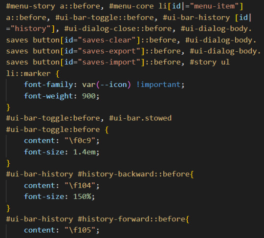
(I set up the family name in the :root {})
CHANGE THE BUILT-IN ICONS OF THE SETTING/SAVE/RESTART
All three are defined under the id #menu-core li[id|="menu-item"] a::before: #menu-core li being the list of buttons for those three API, a::before being the icon before the text of the link. If you are planning to change the icon for each of them, defined the font family/weight with this ID, before moving on to each button, being:
#menu-item-saves a:before
#menu-item-settings a:before
#menu-item-restart a:before
Within each, you need to define the icon name with the content rule, inside brackets (like the picture above). FontAwesome should give you the relevant code to include.
ADD ICONS TO THE STORYMENU LINKS
One passage which only accepts links is the StoryMenu. It is formatted similarly to the links in the section just before, but the class to target is this one: #menu-story a::before.
Note: defining an icon with this class will add the same icon to all links in this passage. If you want different ones for each link, you will need to use the :first-child, :nth-child() and/or :last-child selector.
ADD ICONS TO OTHER UI-BAR SPECIAL PASSAGE
For StoryAuthor, StoryBanner, StoryCaption, StoryDisplayTitle and StorySubtitle, there will be no need to fiddle with the CSS (unless you want to). Instead you just need to add the HTML markup of the icon of your choice before the link. For example:
(I can't copy the code on Tumblr, but FontAwesome will have it for each icon).
If for whatever reason you want to edit the icon (colour, size, etc...) you'd need to target the i (for icon) inside the relevant id. Following the order of the Special Passage Names, it would look like:
#story-author i
#story-banner i
#story-caption i
#story-title i
#story-subtitle i
I hope this helps!
7 notes
·
View notes